PENNY LANE CENTERS / REBRAND AND UX DESIGN
Penny Lane Centers has been providing services for families and underserved communities in Los Angeles County since 1969. Their branding needed to reflect the work they do and needed to feel fresh and current. Their website also needed an overhaul. Instead of being a user-friendly hub for easy access to their organization's 30+ programs and services, it turned out to be a complex and confusing labyrinth of menus without clear direction for their users. (You can check out their previous website and branding here.)
PHASE 1: BRANDING: DISCOVER & DEFINE
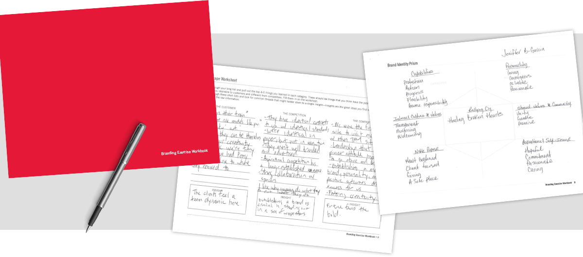
The Penny Lane executive team felt that the voices of every team member were important, so we opened the discovery process up to the entire workforce. I used worksheets I had developed over the years to conduct meetings, explain processes, and distribute branding exercises. Then, I collected and analyzed all the data to define Penny Lane Centers for everyone who worked in the organization, not just those at the top.
From this research, I was able to gain a clear direction on where to steer the brand and to begin to define the needs of the site.
PHASE 1: BRANDING: DISCOVER & DEFINE
Turning that data into three clear visual directions, I created mood boards that allowed me to align the team's ideas about the brand with my suggestions for a new aesthetic. With sign-off on the "Happiness" direction, I was able to move forward into some traditional design work.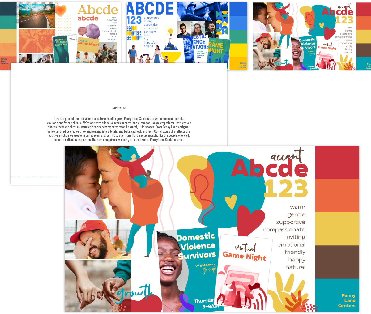
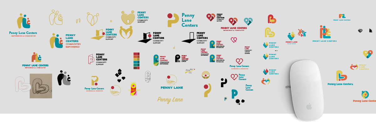
PHASE 1: BRANDING: LOGO IDEATION & DESIGN
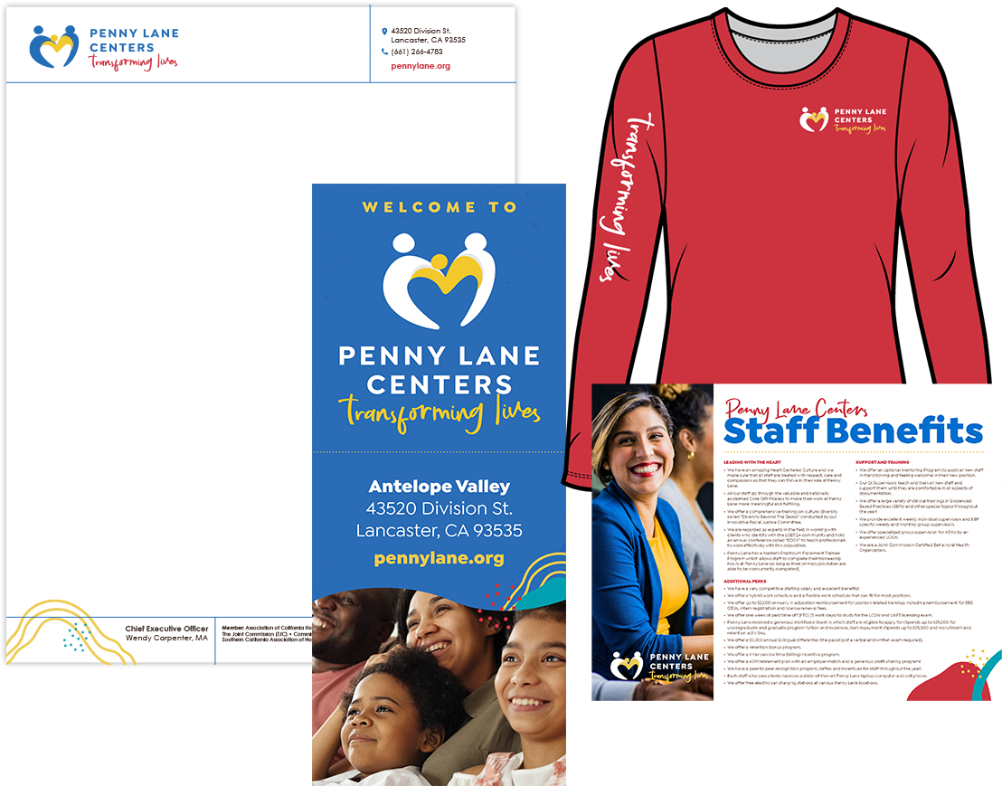
The first item on our list was a redesign of the Penny Lane logo. Through traditional iteration and deduction, we arrived on a logo that tells the story of a family (or two people supporting a third) with a heart at the center, reflecting the soul of the work Penny Lane does.
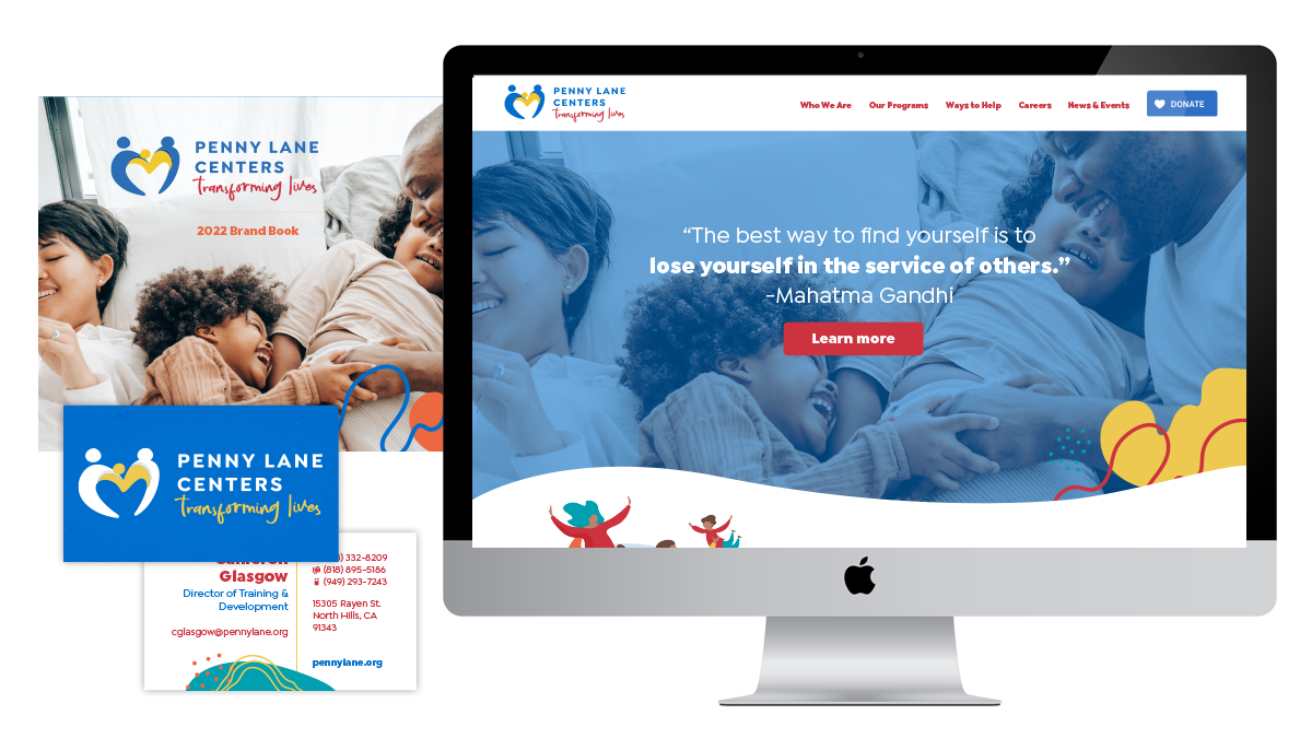
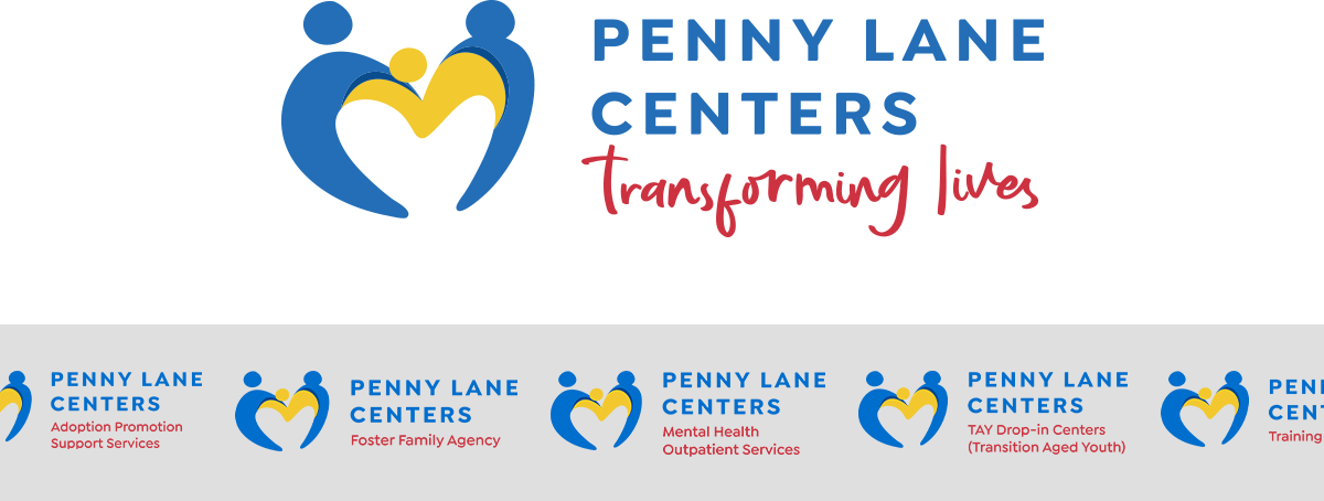
Penny Lane Centers had various programs adopting individual logos. We established a unified logo system to bring all programs under the Penny Lane name, emphasizing their unity as a family.
PHASE 1: BRANDING: DESIGN SYSTEM
Now, I was able to create a complete design system based on the compiled research, feedback, and mood boards. Collaborating with a copywriter, I delivered a style guide that equipped Penny Lane with the resources to not only implement their fresh aesthetic but also to articulate their brand through tone and messaging.
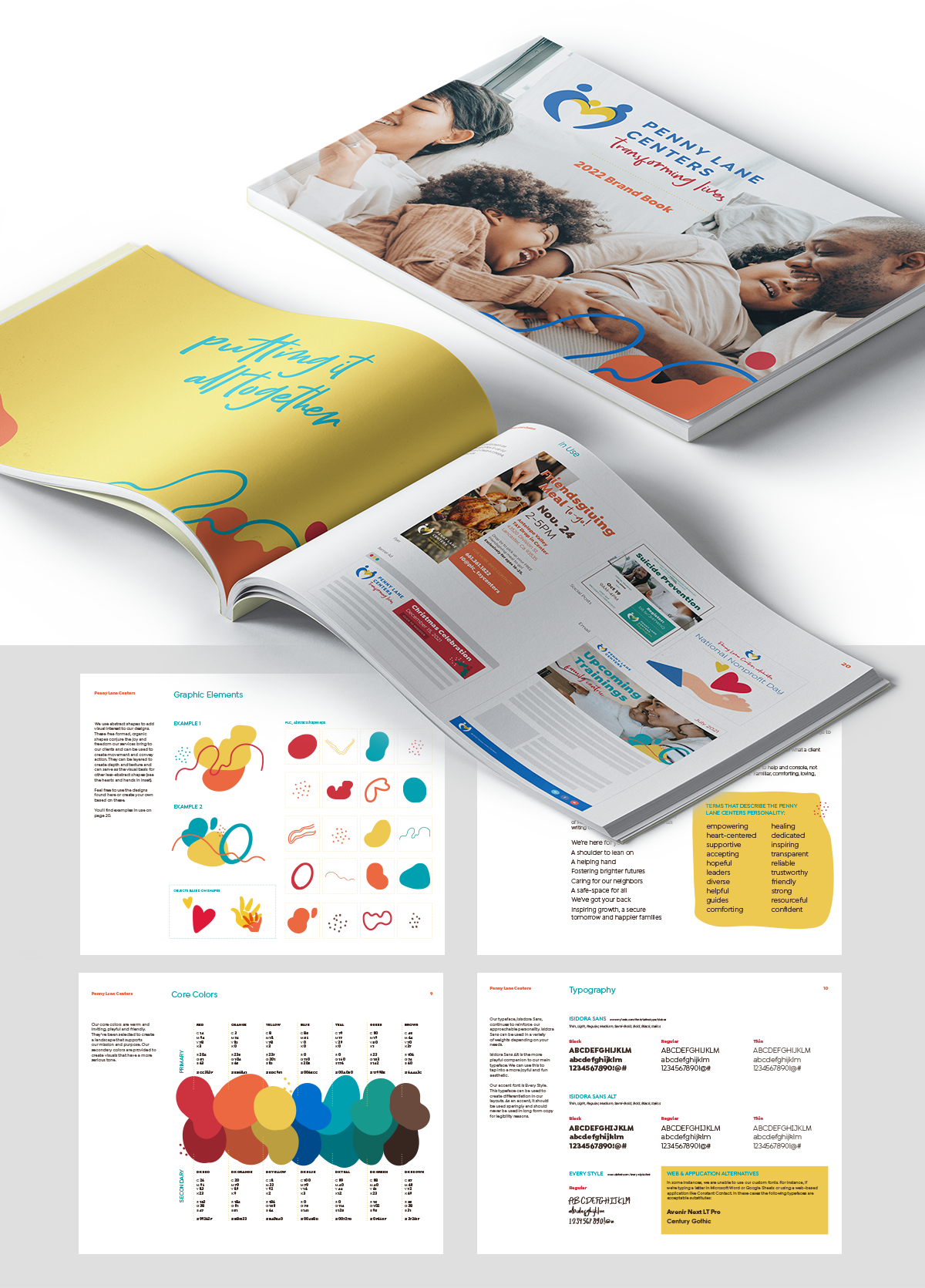
PHASE 1: BRANDING: DESIGN SYSTEM SUCCESS
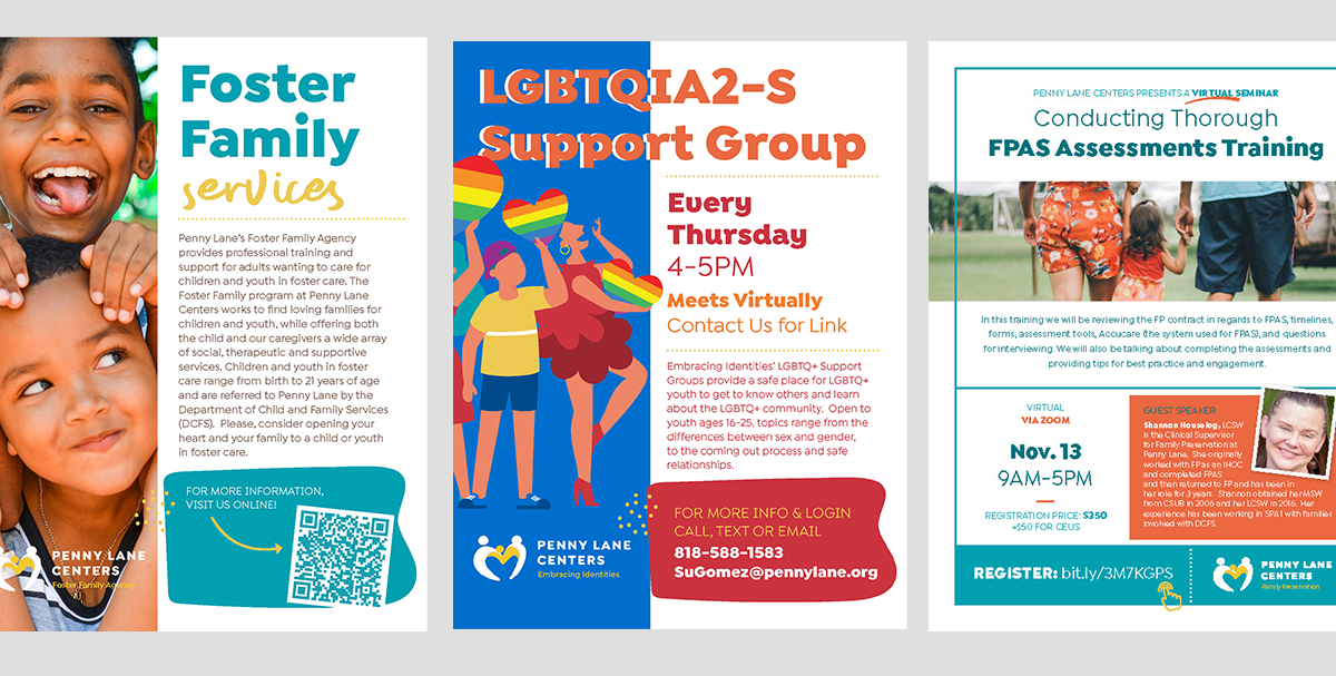
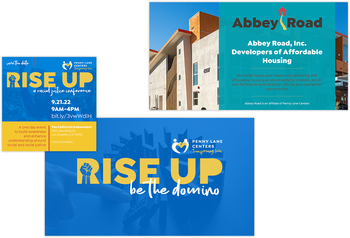
A successful design system is evident when it can adapt to various purposes without losing its character. Penny Lane Center covers themes ranging from teen homelessness and professional therapist training to fun social services like community Trunk or Treat events. In every instance, the new Penny Lane branding maintains its identity and feels perfectly in place. It even serves as a foundation for affiliated programs and events, such as their annual RiseUp event and their housing program, Abbey Road.
PHASE 2: UX DESIGN: DEFINE USER GOALS
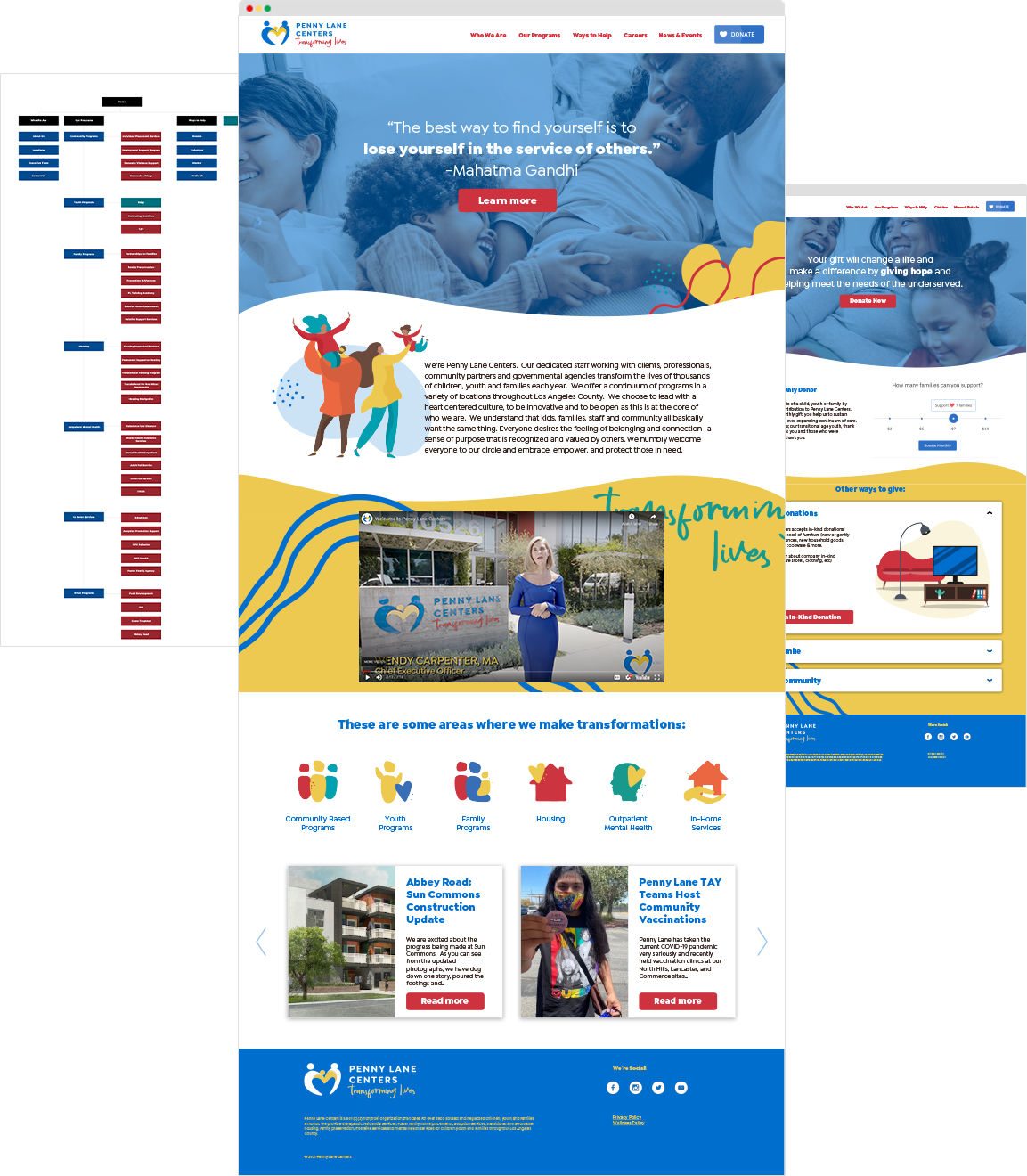
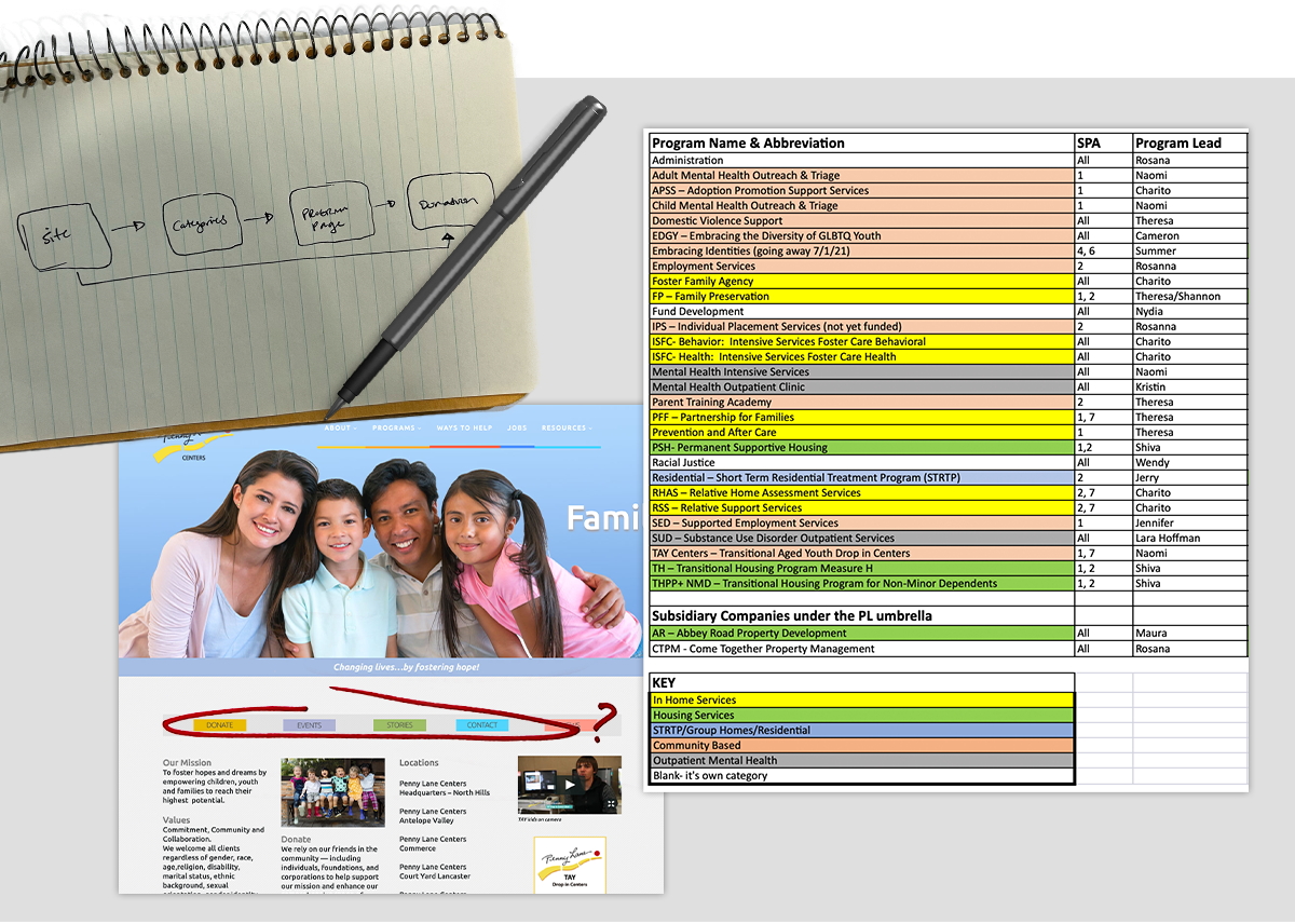
After an analysis of their old site, I built on the information collected during my Phase 1 discovery process by expanding my research to include additional users, such as clients and resource partners who would use Penny Lane's website. Through their feedback, I identified two primary objectives for the new site: to efficiently organize and promote individual programs and to clearly drive donations. Using this framework, I worked with my partner at Penny Lane to organize their multiple programs into seven new broad categories like Family Programs or Mental Health Services.
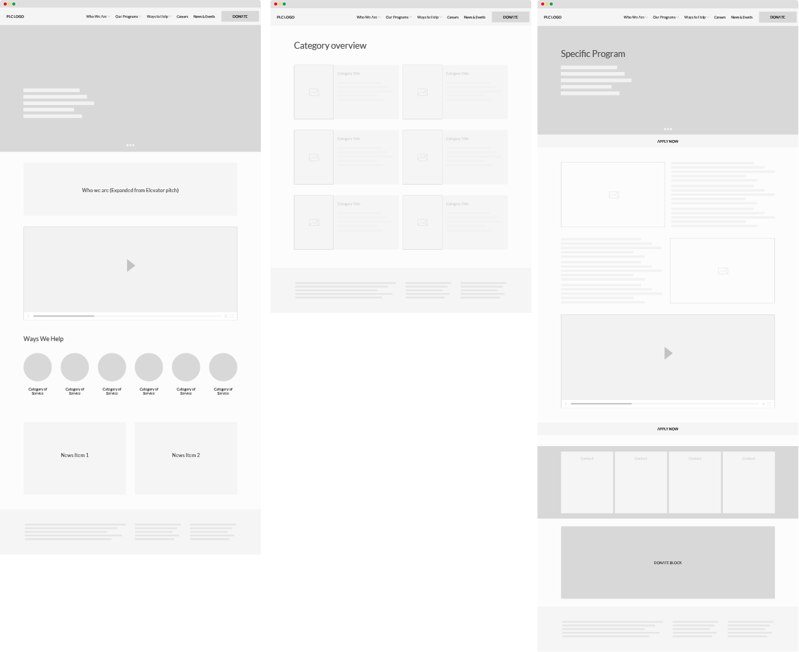
PHASE 2: UX DESIGN: PROTOTYPE & UI DESIGN
I created site maps and low-fidelity prototypes incrementally, enabling me to gradually introduce Penny Lane to the new organizational and design concepts and obtain their approval. I then partnered with FundraiseUp to bring Penny Lane a new way to integrate donation systems on their page. Finally, using the identity system created in Phase 1, high-fidelity designs were created and executed.